Are cryptocurrencies currently undervalued or overvalued? When is the best time to sell? These are the kinds of questions that every crypto investor wants to know the answers to – they can, after all, be used to better plan investments. In the BISON app, we now provide you with a foundation for analyzing the crypto market: Twitter Sentiment, along with the Simple Moving Average (SMA) and Relative Strength Index (RSI) technical indicators, work to determine psychological market sentiment, average price movement, and price movement intensity. These three indicators can be applied to any cryptocurrency tradeable on BISON: Bitcoin, Ethereum, Litecoin, Ripple (XRP), Bitcoin Cash, Uniswap, and Chainlink.
In the following article, we’ll show you where you can find the indicators, along with what options are available for viewing charts and the insight you can derive from them. Richard “Richy” Dittrich – best known for his interviews with BISON CEO Ulli Spankowski and the Stuttgart Stock Exchange’s Kryptoupdates – also provides a clear explanation of these indicators in a video. In it, Richy even shares valuable tips on how to get started analyzing the crypto market with them.
Legal Preliminary Note: The following information is neither advice nor a trading recommendation. Instead, it provides information of a general nature that may not be correct, may be outdated, or may not be applicable to each individual case. The technical indicators provided are intended to serve as a source of information and provide additional support for investment decisions you make in the crypto market.
Table of Contents
Richy Explains Technical Indicators
Examples last updated on: October 15th, 2021.
Video is only available in German language.
Click here to watch the video
Where Can You Find Technical Indicators in the BISON App?
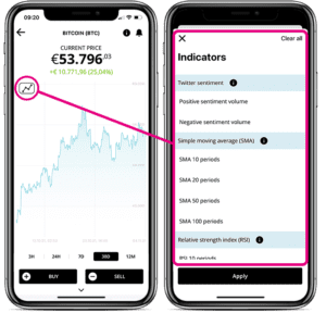
In the market overview, start by selecting a cryptocurrency. Then click on the icon in the upper left corner. At this point, three different ways to view the chart will be presented: Twitter Sentiment, Simple Moving Average (SMA), and Relative Strength Index (RSI). A maximum of three indicators can be selected at the same time.
Twitter Sentiment
Twitter Sentiment works in a way similar to BISON’s Sentiment. Tweets are read by means of artificial intelligence and then processed accordingly at BISON. The chart reveals how many posts are circulating about a given coin, as well as how many of these posts are positive or negative. Unlike BISON’s Sentiment, the Twitter Sentiment is located directly in the price chart. Here, you can choose between positive and negative Twitter posts, or display both.
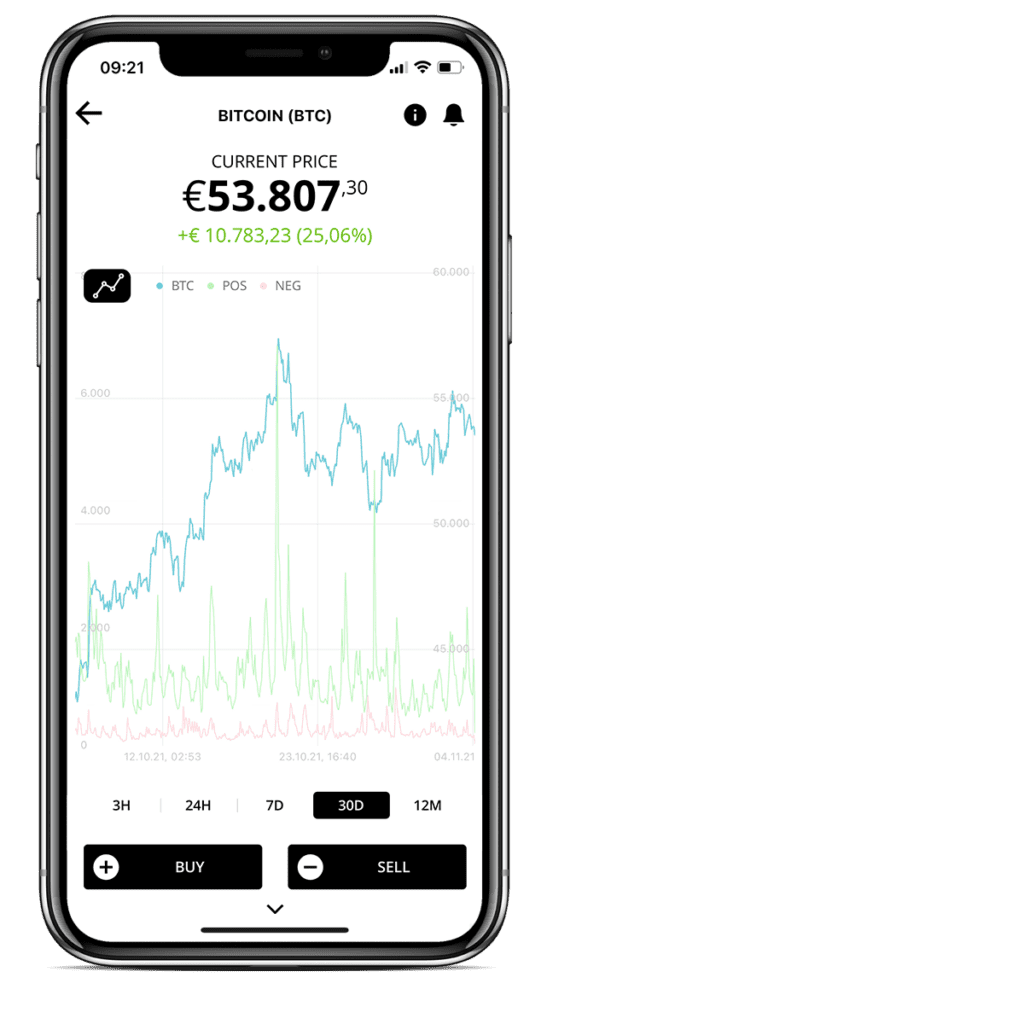
After making your selection, two additional pieces of information appear next to the price chart: A red oscillator for negative tweets and a green oscillator for positive tweets. The values are displayed as soon as your finger – or your cursor if you’re using the web application – moves over the chart.
Richy comments that “…with Bitcoin, you can clearly see that in the last 30 days – but also over the last six months – the sentiment has actually been relatively good. Every once in a while we see little red peaks in there.”
On September 24th, 2021, for instance, we see that there were quite a number of positive posts – yet also over 1,500 negative posts. Richy explains this peak in negative comments: “We know that at that time, China classified cryptocurrency trading as illegal, resulting in a fairly bad reaction from the market. Shortly before that, we had a major problem with Evergrande – and here, too, we can see that the market had a reaction.”
Richy has another useful tip regarding Twitter Sentiment: “The shorter the time period is – meaning the further you zoom into the chart [for example, from 7 days to 3 hours] – the crazier the values become. Here, of course, is where – minute by minute – various tweet positions are displayed. Perhaps it’s better to take a step back and view it from a bit of distance.”
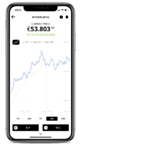
Simple Moving Average (SMA)
The Simple Moving Average is the average price of a cryptocurrency within a certain time period. With the Simple Moving Average, the period must be defined first. This allows the interval you want to observe to be narrowed down more precisely. The significance of the period depends on which price chart you use. According to Richy, “…if you’re looking at a yearly chart, then one period in the BISON app corresponds to one day. If you’re looking at a 30-day chart, a period would be two hours – and then 30 minutes on a 7-day chart, and 30 seconds on a 3-hour chart.”
Richy uses the periods 10 and 100 in the 30-day view as an example to illustrate just how fine-grained or coarse a representation can be. “When working with SMA 10, we know with 30 days that the individual intervals are always two hours, and we’ve plotted the average of the last 10 times as two hours in the pink chart. With the 100 line, 30 days are also shown as two hours. But, having looked at 100 periods, we see that the yellow chart is significantly smoother (…) and further away from the current price.” One general rule is that when a short-term indicator breaks a long-term indicator from top to bottom, chart analysts tend to regard it as a signal to sell. If a short-term indicator breaks the long-term indicator upwards, chart analysts tend to assume that there is a higher probability that the price will move upwards than vice versa. It is important to note, however, that this is not intended as a form of advice or recommendation; these are merely the normal rules of play when it comes to technical analysis!
Relative Strength Index (RSI)
The Relative Strength Index (RSI) identifies overvalued or undervalued areas in the market. Richy clarifies that “…relative strength is actually a misnomer because, typically, we’d have to talk about intrinsic strength here. Relative would always be in relation to something else.”
The RSI looks at the upward and downward closing prices within a certain period of time and then calculates out extreme situations, i.e. extreme outliers moving upwards and downwards. This way, it can be determined on average whether a particular coin is currently overbought or oversold. The RSI ranges between the values 0 and 100. Values less than or equal to 30 tend to suggest an undervaluation, while values greater than or equal to 70 tend to suggest an overvaluation.
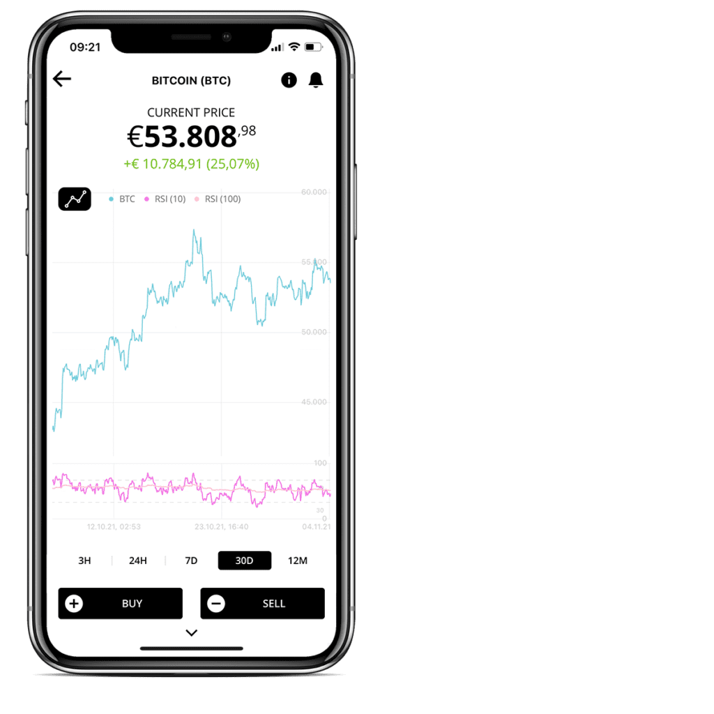
For a clear view of the difference, periods 10 and 100 are, again, a good choice. New pieces of information will appear under the chart when it is activated. The jagged line is the shorter-term market (RSI 10) and the smoother line is the RSI 100. For those with a longer investment timeframe, it’s worth looking at more long-term periods. As Richy analyzes the current market, he says: “In the short-term, we’re currently at 71.05, so chart analysts believe that the market is quite hot now.”
Combining the Technical Indicators
Richy emphasizes that “…the most crucial move is combining the various pieces of information; solely reading charts is not the right thing to do, while solely listening to your own gut definitely isn’t right either, and solely reading the news could also prove to be wrong. Everything has to go together!” It is possible to have three indicators displayed in the chart at the same time – room for more isn’t available on most phones anyway. By combining different information, we avoid false signals that tend to occur when looking at individual charts. Richy: “I’m going to assume that we’re more short-term oriented, (…) so I’m choosing RSI 20, SMA 20, and SMA 100 here. This way, I have a long-term and short-term average, and I can also see [the overlapping of values].”

Simple Example
SMA: There is a point in time in the chart where you can clearly see that the short-term indicator has exceeded the long-term indicator in an upward direction.
RSI: At the same point in time, the RSI, at 45, was definitely not overbought given that it did not exceed 70. Looking solely at the technical information, a potential buying opportunity can be derived from this combination.
Simple Example
SMA: The short-term has fallen below the long-term chart. RSI: The RSI lies at 53, meaning it is quite neutral. No clear signal can be read here, hence why combining pieces of information is crucial!
Will There Be More Indicators Available?
For Richy, the answer is simple: “Let it be a surprise! We have some other chart indicators that we’d like to include – so these are in the works to come. Have fun, good luck investing, and remember to stick with your BISON herd.”